Our History of Web Design
by De Ivett
Website development has come a long way since the first website was built in 1991 by Tim Berners-Lee, a British computer scientist, who is often credited as the inventor of the World Wide Web. The first website was simple text only (no graphics) along with hyperlinks to other pages. It provided information about the World Wide Web, instructions on how to create a website, and details on how to write HTML code.
See How Far We’ve Come at a Glance:
| Feature | 1993 | 1999 | 2023 |
| Color Depth | 8-bit (256 colors) | 16-bit (thousands of colors) | 24-bit (millions of colors) |
| Screen Resolution | 640×480 | 800×600 | 1920×1080 |
| Bandwidth | 14.4 to 28.8 Kbps | 28.8 to 56 Kbps | 25 to 100 Mbps |
| Video Footprint | postage stamp size | 320×240 | 1920×1080 |
| Animation | Animated gif, cgi script | Flash | HTML5 |
My Story Starts in 1993 as a “Pixel Pusher”
The very first website project I worked on in 1993 was for Mexicana Airlines. I had to create postage stamp-sized 8-bit banner graphics for their website. I was limited to 256 colors and had to work on the images pixel by pixel. Back then we referred to that process as “pixel pushing”.
To make things even more complicated, only 216 of the 256 colors in the 8-bit pallet were cross-platform compatible. These 216 specific colors are displayed consistently across Windows and Macintosh computers, as well as across various web browsers, and were referred to as the “web-safe” color palette. Thankfully now our web pallet is comprised of millions of colors making the processing of images much easier.
A 15-inch Monitor was Standard in 1996
One of the first websites that I built was for the band “Tool” in 1996. Built using HTML and Flash, this site was designed for a 640-pixel width monitor and included a free downloadable screensaver. The Flash animation of the “Tool DNA” followed the user’s mouse, changing rotation as the user moved the mouse around the screen.
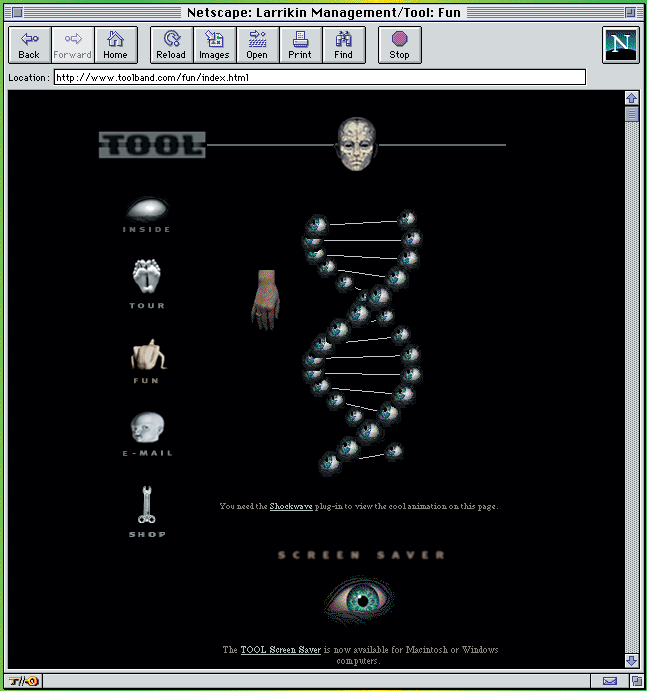
The screenshot above shows the website loaded into the original Netscape browser. To access the internet we had to dial up using a landline connected to a modem connected to the computer. It took about a minute to load the web page with the embedded Flash animation using a standard 56k connection. Because Flash relied on a plugin, we had to create two versions of every page – one version for Flash users and one for everyone else. By detecting if the user had the plugin installed, we could direct them to the appropriate page, or ask them to download the plugin. That was called a “sniffer.”
The Average Screen Resolution More Than Doubled Over 3 Decades
The first monitor size we designed for was a mere 640 pixels wide to run on a 13-inch monitor. Even though in 1999, the most common screen resolution for websites was 800×600 pixels, Schecter Guitars needed to accommodate their B2B customers who were primarily running on smaller 13-inch monitors. There was no concept of responsive or adaptive coding to dynamically scale to fit the device. Today it is common to use a responsive framework to work perfectly across the interwebs.
When did we Lose our Patience?
In 1996, it took about a minute to download a 256k web page. Our goal was to get a page to load in less than a minute, otherwise, we had to come up with some cool loader animation to keep the user entertained while the files were downloading. Now, if a page takes longer than 2-3 seconds to load, the user will often move on to the next website.
Today users have increasingly high expectations for fast-loading websites, and a delay of just a few seconds can lead to frustration and increased bounce rates. The current target page load time is 1 second or less. Faster page load times positively impact user experience, engagement, and conversion rates.
Google considers page speed as a ranking factor, as they prioritize delivering a good user experience to their users. Websites with faster page load times tend to perform better in SERP (search engine results pages).

The Schecter Diamond Series website was built with Flash, an animation and programming tool that became no longer compatible with modern browsers in 2020. Flash also made it hard for Google to track user behavior as every action was in Flash rather than the HTML. Google Analytics became available in 2005.
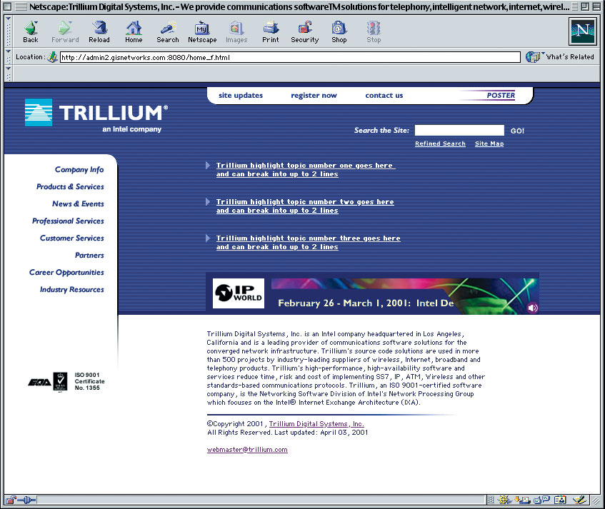
Another site that we built during the same timeframe in 2000 for Trillium (later bought by Intel) had a target size of 800 pixels wide. Notice how light the design is in terms of graphics. This site was built on a proprietary framework designed for performance, with the home page loading in under 20 seconds in a low-bandwidth tech world. The animated banner advertising the upcoming trade show was created in Flash so that it could be updated dynamically from the server.
Today, web development has finally come full circle, and we can now create dynamic animated websites with audio using HTML5 code.
Video the Size of a Postage Stamp?
First of all, video on the web was around way before YouTube. We used special plates like Video for Windows and Real Player. Videos had to be encoded separately and served up for both Windows and Mac using yet another “sniffer.”
The first videos were so tiny – some as small as 160×120 with as little as 10 frames per second to keep the file size small so the video would play back in real-time. We “buffered” the videos to preload as much as possible so the video would play all the way through without stuttering.
It was a pretty bad experience in the early days but in 2005 YouTube was launched and the web set off in a new direction.
Now with more than 500 hours of video uploaded every minute and more than one billion hours watched every day, YouTube has maintained its position as the world’s second-largest search engine after its current owner, Google.
20-year Evolution of a Brand’s Website
The Daisy Rock Girl Guitar brand offering guitars designed for young girls was launched by Tish Ciravolo in 2000. I had the honor of launching her first website in 2000 featuring the first daisy-shaped guitar designed for girls. The first website was designed at 640 pixels wide and programmed using standard HTML.

In 2006 as the company was rapidly adding new models to the site, we rebuilt the site on a custom PHP content management system to make it easy to manage customers, dealers, news, and its growing artist roster. The new site was designed at 720 pixels wide with a larger background image for users with larger monitors to give it a full-screen appearance on larger monitors.
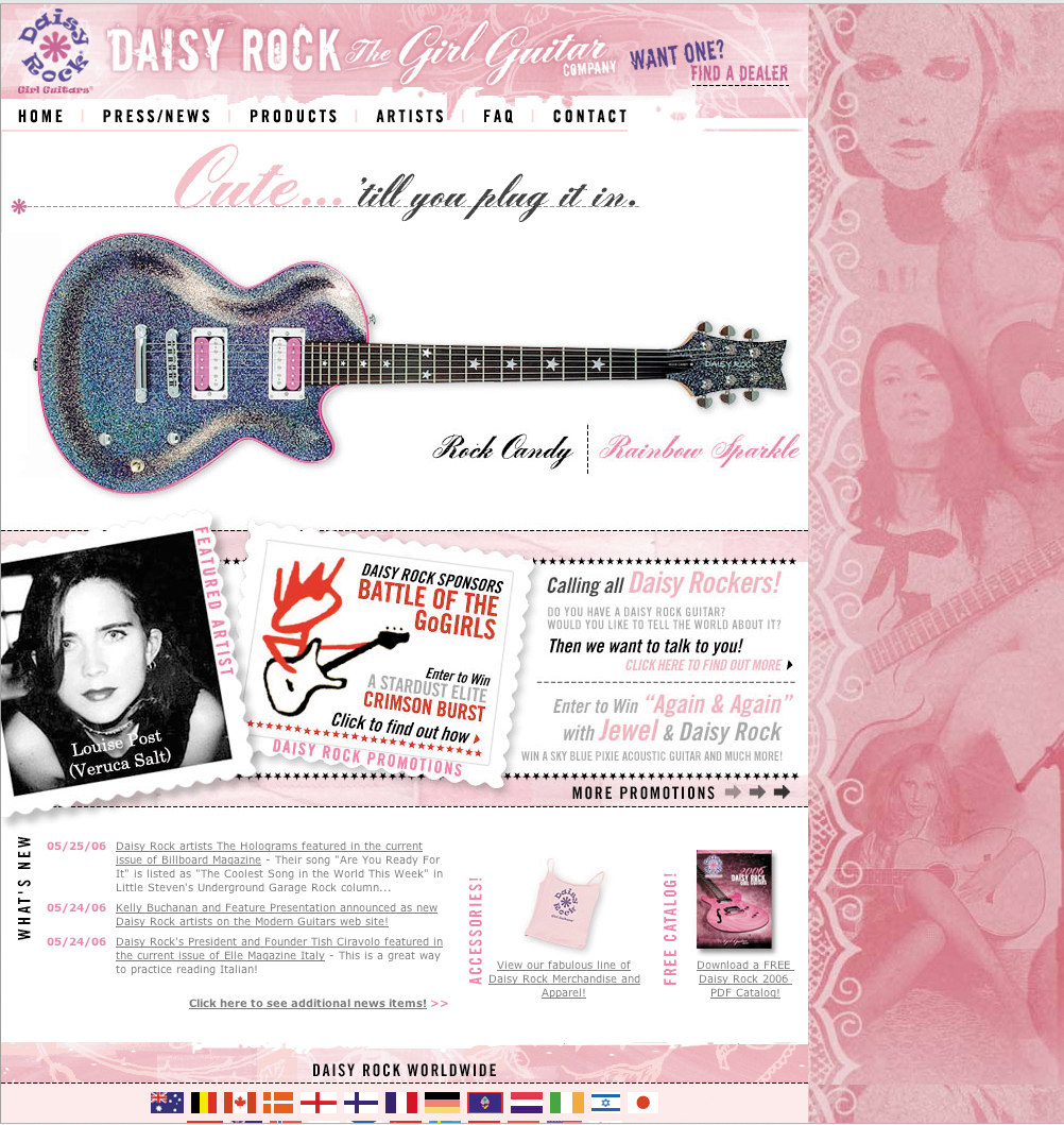
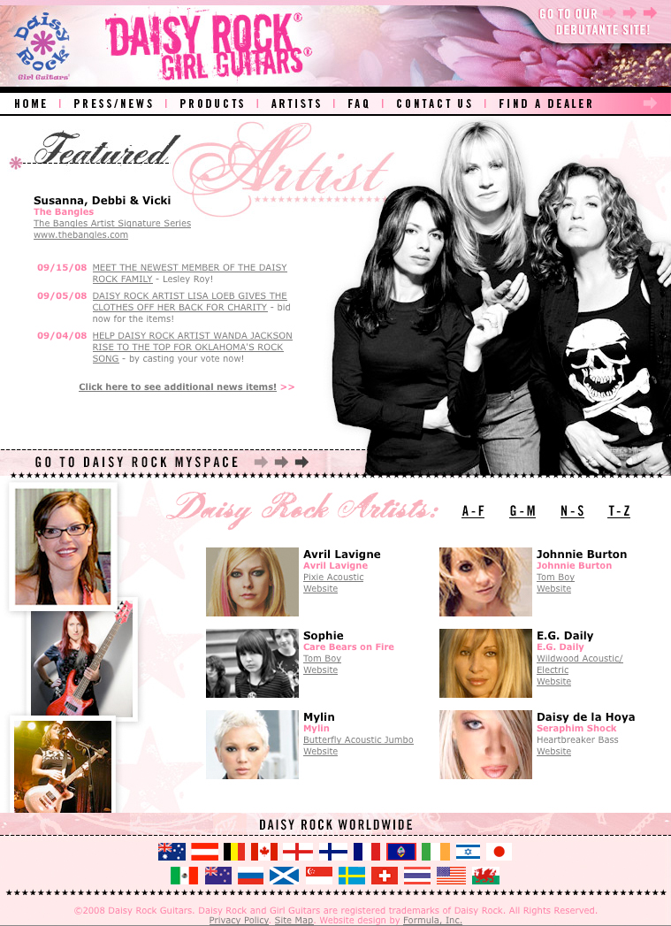
By 2008 the brand had launched its first signature guitar with “the Bangles” leading the company to reposition the brand by separating the professional guitars from the “Debutante” guitars for younger girls. This made it easier for customers to shop. The new design allowed customers to easily switch back and forth between the two guitar sites.

In 2010 the decade-old brand had outgrown its custom website and was rebuilt on the robust Drupal platform to allow seamless integration with the Shopatron platform for the dealer distribution of orders.
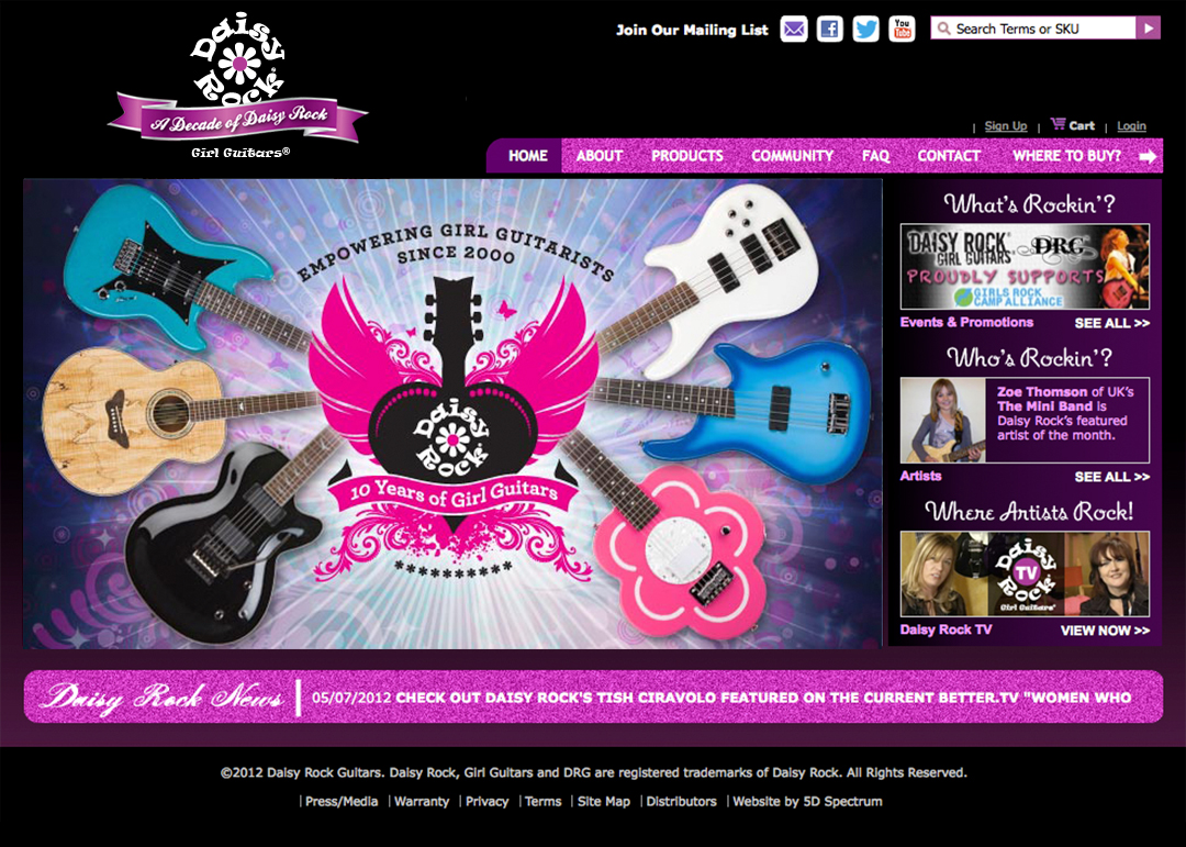
By 2012 a mobile version of the site was deployed as the use of mobile devices was starting to exceed the use of desktop computers for browsing the web.

This upgrade yielded stellar results for their online sales.
“5D Spectrum came to us with great ideas, excitement, and they quickly gained a firm grasp of our objectives. In every sense, they exceeded our expectations every step of the way. Our online sales through daisyrock.com increased 81% in the first 11 months after deployment. Plus, our backend architecture has allowed us to manage the data ourselves, so our annual website maintenance costs have decreased. I highly recommend 5D Spectrum for any website needs you have and I couldn’t be happier with their team and their work.”
~ Rich Lackowski,
Daisy Rock Girl Guitars Marketing Director
By 2014 as the Daisy Rock brand expanded its product line by adding Ukuleles to the mix, a fresh design was implemented to show off the expanding categories of instruments and to do it “above the fold”.
“Above the fold” is a term used to describe the information that is visible when the page first loads without scrolling on a desktop device.
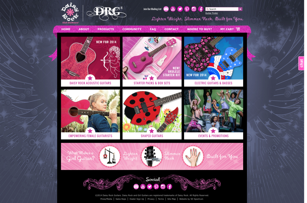
This site carried the Daisy Rock brand through to 2019 completing nearly 2 decades of development cycles.
Web Design Today
Web design practices have evolved significantly since 1999. With the advancement of technology and the introduction of larger monitors with higher resolutions and mobile devices, web design has become more flexible and responsive to accommodate various screen sizes and resolutions.
As of 2020, the most common screen resolution for web design was 1920×1080 pixels. This resolution, often referred to as Full HD or 1080p, became the prevailing standard for desktop and laptop screens.
With the rise in popularity of mobile devices, responsive design has become essential to ensure optimal user experience across various screen sizes and resolutions. As a result, web designers have been incorporating responsive design techniques to adapt their websites to different devices, including smartphones and tablets.


Contact 5D Spectrum to bring your site into 2023!