5D Spectrum launches the Philos-Sophia Initiative Foundation Website
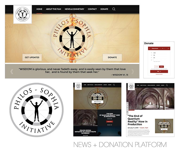
Working with the original team from “The Principle” – a documentary film in which 5D Spectrum provided design, programming and marketing services in addition to developing the DVD; 5D Spectrum was engaged by the Philos-Sophia Initiative Foundation to create a brand identity and website. Founder and mathematician/philosopher/physicist extraordinaire Dr. Wolfgang Smith has chosen to emerge now, at the summit of his life’s work, in order to prepare a new generation for what he calls “a singular moment in history.” Dr. Smith will be granting an interview to the original production team from The Principle including Katheryn KTEE Thomas (Director, Producer) and Rick DeLano (Producer, Narrator). The foundation website will be used to market the new film “The End of Quantum Reality” and provide an outlet for Dr. Smith to share his personal knowledge and philosophies. To see the trailer for the upcoming documentary film “The End of Quantum Reality” visit the Philos-sophia.org website.

The font selected for this logo, Trajan, is one of the oldest traditional letterforms.
Edward Caitch was a Roman Catholic priest who, as a master calligrapher, had been researching the typeface and was unconvinced that these typefaces were based solely on chiseling techniques, and surmised that the serifs they contained were in fact the result of painted calligraphy. Caitch showed that the letters were painted onto the stone, wherupon the expert stone-masons would then chisel the characters out.
The new logo was brought to life with a subtle animation used on the hero image of the website landing page.

To find out more about this exciting project visit our portfolio!