Do’s and Don’ts of Logo Design

5D’s Creative Director, Nancy Batlin, sat down to discuss logo design do’s and don’ts
The design process can be tricky to navigate. In a visual landscape, trying to make your business stand out can be challenging. Nancy Batlin, Creative Director at 5D, answered some questions about logo design, the design process, and what makes a logo work.
When starting a design project, what is the first thing you consider?
The client – what’s their business about, how are they positioned in the industry, who are their audience targets, how do they want to be perceived, and who are their competitors? These questions need to be answered in order to design a logo that has meaning.
The 5D Discovery process is key to developing the foundation of a client’s brand and their “voice”. A logo is not a brand. It’s one of a number of manifestations of the brand strategy and positioning. Without that understanding, you’re designing in the dark. Context is everything.
What makes a strong logo?
Context– The logo needs to evoke the “voice” of the brand – it’s the visual representation of the company’s identity. So, it needs to represent the “voice” accurately. For example, if a company’s values – the way they want to be perceived – are “fun, modern, bold”, then the logo needs to emulate that.
Simplicity – some logo designs try to tell the entire company story in one mark. It’s often too many concepts and too many elements, resulting in a visually complicated, misunderstood representation of the company. And usually, it doesn’t replicate well when applied to smaller applications such as social icons as well as larger applications like environmental design/signage where the logo might need to be fabricated in a single material – metal for example.
Clarity – a succinct impactful message that is the essence of the brand and “voice” is what makes a logo strong and successful – “Target” is a great example. Two simple red circles.
Clever – clever to me means a unique and distinctive concept that is the distillation of what a company is about. Simplicity with a twist that, over time becomes memorable. That’s the greatest challenge in designing a logo but it’s also a fun, creative process. A puzzle to be solved.
Are there any don’ts of logo designing?
Don’t design without understanding the client, their brand, and target audiences first.
Don’t design in a vacuum – research your ideas to ensure you’re developing something original. There are thousands and thousands of logo designs out there. You don’t want to put the client at risk with something that is too close to another logo. That could result in a messy legal “cease and desist” order which means all the time, money, and brand awareness put into the client’s branding will have been nullified. I’ve seen businesses go financially under because of this. The cost to rebrand and create a new awareness campaign can be very expensive and sometimes too much for a small business. It’s also a damage control PR issue.
Don’t design a logo (as well as develop a name) without knowing you have a good chance of being able to trademark it. Do your research. And encourage clients to take the time and spend the money to trademark their logo to protect the name and design from being used by another company.
Don’t design a logo that is noncompliant- it has to be able to be reproduced in many formats and mediums. It has to be legible…and ADA compliant – that has to do with color palettes and font sizes. If it doesn’t reproduce well in different types of applications then it isn’t a viable solution
Thinking of companies with iconic logos, in your opinion, why do they work so well/why are they so memorable?
It’s an interesting question – some are so simple such as a wordmark – but done well and used consistently and effectively in different marketing channels, you can successfully achieve brand awareness and equity in the logo.
To me, iconic logos are simple but clever and align with the company’s brand positioning. The usage has been calculated and strategic to create awareness, recognition, and trust. Using Target again as an example – two bold red circles. You see it and you know it. The advertising campaigns over the years have often been brilliant – using the logo to punctuate a concept, emotion, or product. The marketing of the Bulls-Eye has been integral in building Target’s personality.
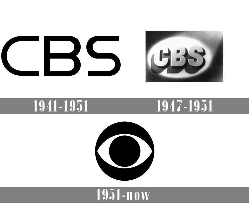
The CBS Eye – it has endured for decades. The design has evolved slightly over time but the original logo design concept has always remained intact. What’s so successful about it is that it has withstood the test of time which is amazing to think that it was launched during the early days of TV and still has a place in our digital world. The meaning and the design hold up.

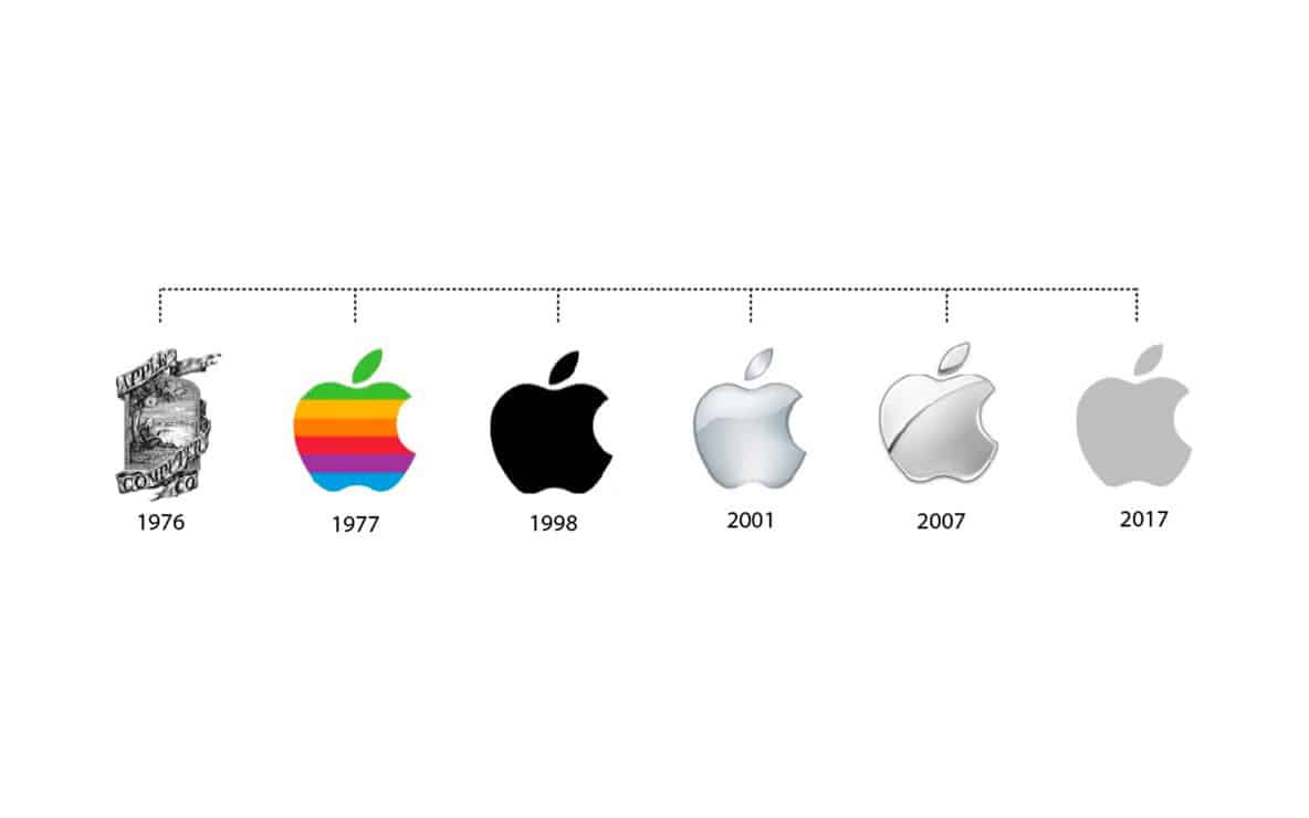
Apple logo with a bite out of it – there are several stories out there about the origins of the logo – but ultimately it was unique and so was the launch of the Mac computer – the apple played an integral role in the marketing and branding – it is without a doubt one of the top recognizable iconic logos.
How do you overcome a design challenge?
In my mind, a design challenge can mean different things, depending on the situation. Sometimes a client has a very specific idea that may not always be practical in terms of usage needs, or it could be too close to a logo that’s already out there. Whatever the issue is, applying research and logic to your ideas gives reason and purpose to solutions offered. You have to be sensitive to clients’ vision, balancing your expertise, to ensure that the outcome is a viable solution that everyone can be happy with.
Never present something that you don’t feel good about. Design challenges can also be how the logo will be used – designing a logo that will work as a tiny social media icon and also has to be fabricated for environmental signage requires testing logo ideas before presenting them as solutions. For example, If it needs to be fabricated in a single material for environmental usage as well as more traditional applications, you should do some renderings digitally to see if it will hold up for different applications before presenting it to the client as an option.
How do you select colors, fonts, graphics when designing a logo?
All these elements are driven by the brand strategy and positioning. What the company stands for, the industry they’re in, and how they want to be perceived guides my color, font, and graphics selections to visually represent a company’s brand. I also consider the usages such as print, digital, and environmental.

When do you know when it’s time to update a logo?
You have to have a sound, logical reason to update a logo. It costs time and money and it takes research to understand the pros and cons of updating a logo. And that may include focus groups to understand how your audiences perceive your logo and brand. Some logos stand the test of time and don’t need a redesign. Some just need some evolving to feel more modern and timely or reflect changes in the company – new products, services, audience targets.

Redoing a logo and particularly a complete redesign has to be carefully considered and needs a PR/Marketing campaign to explain why. Updating logos can be misperceived, particularly one that has built up a lot equity and trust in the brand. Unintentionally it can signal changes that can cause concern with target audiences – under new management, instability, the company isn’t not doing well, the quality of what the company offers is changing. Things like that. Trust and brand loyalty can erode. It can have serious revenue loss implications. It doesn’t mean that it shouldn’t be done. It just needs to be done right to improve or enhance customer engagement and the image of the company.
Have a design challenge? Let us help.