Entertainment
5D Spectrum partnered with Forever Musical during its early development phase to create the overall branding and website design based on the client’s provided key artwork.

Services Provided
- Web UI/UX design
- Custom WordPress theme
- Copywriting
- Hosting
- Marketing Strategy & Implementation
- Print Collateral
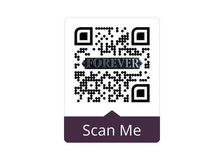
- Custom QR Code
Forever is a modern reimagining of The Picture of Dorian Gray, told through rock music and set against moments in American history. The story centers on youth, fame, and the personal cost of preserving an idealized image. Rather than aiming for spectacle, it creates space for reflection and personal connection.
The goal of this engagement was clear. Create a professional, inviting digital home that could support the musical’s journey forward while building early momentum with donors, producers, and supporters. The website needed to feel human, grounded, and open. It needed to invite people in, not sell them a finished product.
This work reflects an ongoing partnership. The website launch established a foundation that now supports fundraising efforts, outreach, and long-term brand growth.
Website
THE CHALLENGE
At the start of this phase, Forever did not have a central place to tell its story. There was no single destination that brought together the narrative and the practical context needed to engage supporters.
Reaching both Broadway producers and theater patrons added complexity. Each audience needed something slightly different, yet the experience had to feel unified and intentional. Without a clear structure, it was difficult to build confidence, spark interest, or support early fundraising efforts.
The challenge was not credibility. It was clarity. Forever needed a space that could hold the emotional weight of the story while also signaling readiness for what comes next.
THE SOLUTION
5D Spectrum addressed the challenge by aligning strategy, site experience, and messaging into one unified system.
We designed and built a custom WordPress website to serve as the central home for Forever. The site introduces the story with restraint, allowing curiosity to lead the experience. Copy was written to feel shared and open, reinforcing the idea that the story belongs to more than its creators.
The site experience balances polish with approachability. Design choices support the narrative without overpowering it. Visitors are guided naturally from discovery to participation, helping supporters understand how they can engage.
Transparency informed key decisions. The fiscal sponsor partnership is clearly presented to support donor confidence and clarify the path to giving. Alongside the launch, we developed a marketing strategy focused on fundraising readiness and early-stage awareness as the project continues to evolve.
Gallery


